Perhaps it is the time of year – verging on the vernal equinox and a hushed but stirring feeling in the air. On Imbolc, some say that fine weather means six more weeks of winter: the Cailleach has cleared the clouds so that she may gather dryer firewood for more cold weather. If you see a bird fly by with sticks in its beak, on the day, that’s her! The birds have indeed been gathering with a frenzy of late, the weather gusts cold and wet, and everywhere are light burgeoning shades of green and delicate hints of mauve.
This one felt stuck until this morning…go figure. Note ~ “rota” (wheel…) or “rondellus” is the medieval term for a round. “Andante con fuoco”, also in music, means “at walking pace, with fire”.
I’ve been feeling restless – even anxious – and keenly aware that my priorities need a rearrange. It’s been weeks since I’ve been able to sit at my altar without knocking something over or dropping cinders on the floor – that’s strange. I like to spend most of my time alone and yet the world seems very loud and backlit with blue flickering light – that’s telling. I’ve been losing sense of what I love, what projects I want to work on, feeling anxious to meet deadlines that don’t exist – time to slow down. After all, this year’s motto is: NO RUSH.
Gorse… beautiful and so very sharp. I like it for protection/warding work.
It may not seem like much, but I’m leaving Instagram. I feel I am responsible for my own use of time, my own sense of honesty or personal connection with others (and with the collective!), and my own health. Instagram makes it seem that those who live with flare and authenticity have no trouble documenting that on their platform…but I have not found this to be the case in my life. Instagram also makes it seem as though there is no such thing as agency or artists or social awareness or anything at all without their dicey validation.
When catkins look like corpses… “I’ll cut you in half, while you’re smiling ear to ear/And the freedom that you sought/is drifting like a ghost amongst the trees…” (Magic by Bruce Springsteen)
But there ARE other ways to show process, to document inspiration, and to allow others to partake in the kind of slow quiet beauty I wish to cultivate. Hence, this blog post features some examples of the few moments of quiet that I have recently pursued and remembered to value… none of which were posted on Instagram but that I’m happy to highlight here as a signpost for the future.
Variations on a theme…Current corset progress…Modded Somnia Tarot.
A thread of red in the labyrinth of life.
Quietly yours,
Sorsha.
*First line of the Morrígan’s prophecy to the Donn Cúailgne, as translated by Thomas Kinsella.
Hm. This does not feel like one of those moments where I may triumphantly declare:
“I made an Oracle Deck!”
As it happens, I did make one …only I didn’t. It’s called “The Dreams of Pantagruel Oracle” and it is part magical tool, part divination method, and part the extended overtures of a rare old book nerd. The ‘book’ in question is “The Drolatic Dreams of Pantagruel” (original French: Les songes drolatiques de Pantagruel) – a public domain reproduction from 1869 of an original volume from 1565. (See introduction/companion booklet below for more!)
Pantagruel is a giant – a character invented by Francois Rabelais in Renaissance France – whose escapades (and those of his father, Gargantua) form a collection of scholastic, social, and religious commentary as well as baudy, irreverent, often inebriated stories…aimed, it seems, at delighting and enraging the social order of 16th century France.
I did not draw these images… Neither did the 19th century publisher (Tross) of the volume from which they were taken… Neither did the 16th century publisher (Breton) of the volume from which that publisher reproduced them… Neither did Rabelais himself, to whom Breton attributed the artistry of these images… Learned discourse suspects it was illustrator/engraver Louis Desprez who produced other work for Breton in a similar style.
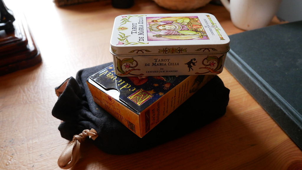
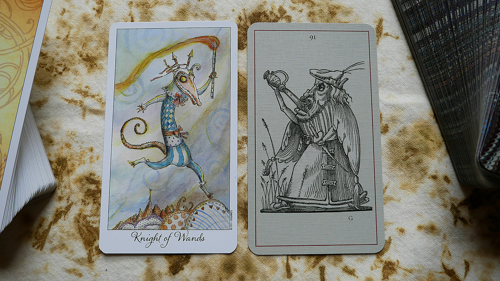
Dreams of Pantagruel with the Joie de Vivre Tarot
The deck has 123 cards in total, measuring 2.75” x 4.75” (70mm x 120mm) in linen card stock and they are now available on MPC.
In the shoplisting I promised a PDF booklet introducing the deck – it includes some basic historical information, some indications of why I made it (other than just wanting it to exist), asks some questions, and leaves the door very wide open for any manner of uses at the total discretion of those who choose to acquire it. It also includes citations!!!
Powered By EmbedPress
What follows are some of my own personal initial thoughts about the deck at this time. My journey in using these cards has only just begun but here goes…
Firstly, I am very interested in the weird ‘Bosch’-like world to be found on the margins of society. I like to ask myself questions about how society asks questions. Having worked in different kinds of archives over time, fulfilling queries for different kinds of researchers on different topics, it’s astounding just how much the assumptions in approach inform (or limit) retrieval and results. Of course, the way information is catalogued can also skew things… as do ‘hidden collections’ – collections that exist but are horribly back-logged, invisible until allocation of resources and social priority allow ‘us’ to ‘see’ them.
Secondly, I’m interested in the shapeshifting nature of personal characteristics but I want to be very clear that, in my opinion, equating moral or social value with physical appearance is unacceptable. There is enough work on our hands to undo tropes around ‘disfigurement = sign of evil’ in fairy tales and fantasy without adding to it through the misuse of our creativity going forward. The characters in this deck are not automatically marginalised or considered unfavourable. The worldview that created them was flawed (for one thing Rabelais, author of the Gargantua/Pantagruel stories was definitely sexist!) and the worldview of ‘curious persons’ who view and respond to these images will create what they bring to the deck… to put it bluntly.
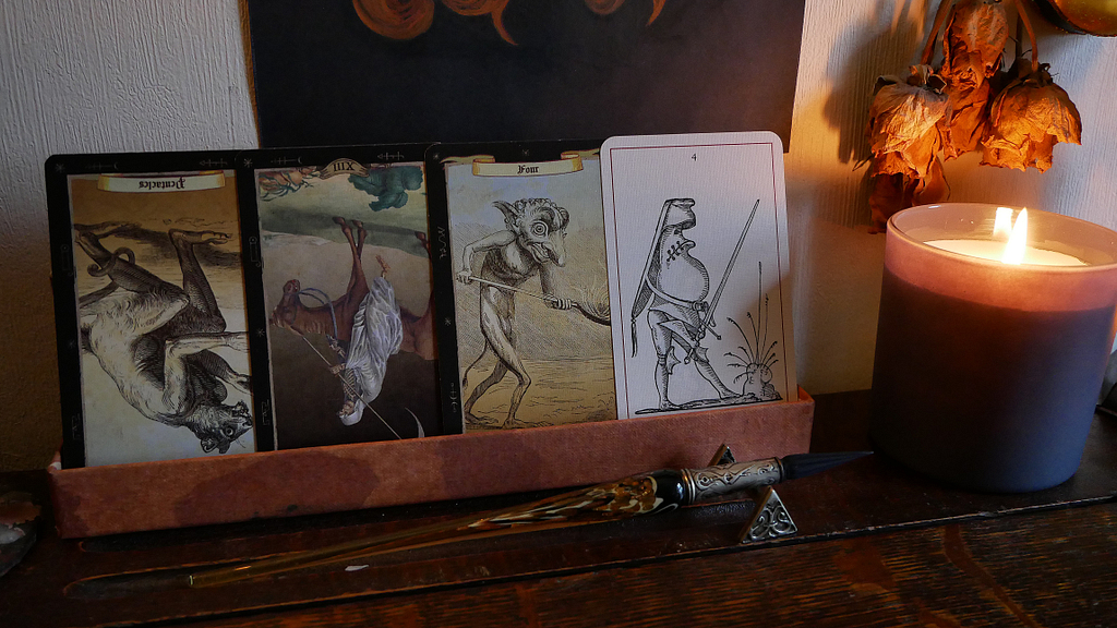
Dreams of Pantagruel with Le Tarot Noir
Thirdly, assessment is on-going…but this deck is one step in the much larger personal aim of seeing the world in terms of the imaginative qualities of its inhabitants. I guess you could say I wanted a deck of ‘friends’ to support me in that work. “Familiars”? “Servitors”? Demon-cohorts whose names are Legion?
Fourthly, I’m SLOWLY going to be learning as much as I can about the historical details in these images. I already recognise certain clothing elements that leave clues as to what some of the jokes or references might be. (Such as pin cushion codpieces…) It’s not immediately clear to me how much of these images are already understood from an (art) historian’s point of view, but I’m eager to see the extent to which whatever details I uncover influence my own self-styled way of being, visually and otherwise.
Fifthly, it’s no fluke that Renaissance imagery should make sense in terms of tarot visuals. I’m enjoying the way this pairs with various decks in my own Oracular Library!
Dreams of Pantagruel with the Magicae Daemonibus Tarot… this morning’s shadow work!
Lastly, within the framework of Irish myth, medieval literature, and various iterations of ‘fairy-faith’ or dealings with the Other Crowd… there is a lot I want to explore about how I perceive denizens of Otherworlds and how that fits into my own mythological/cosmological framework. I’m in the process of exploring and expanding my own astral realm (a place I have been referring to lately as “the little cosmos”) but none of that is solidified and it’s well beyond the scope of this blog post…
I hope my ideas are not too superimposed onto the deck for having shared them a bit here! And I hope very much that whoever decides to buy the deck enjoys it and derives benefit from it in some way. I’m going to explore other ways/platforms of making it accessible in time but, for now, do remember that the images from the 1869 volume are in the public domain! Go check them out too!
This week’s video is, in part, an update on my tarot & art practice, projects, & preferences… as well as a discussion of archetypes, imagination, and social expectations. I find endless interest in how this comes to bear on decks that defy or exist tangential to traditional tarot systems.
I also briefly showed my current Oracle deck project, titled “Dreams of Pantagruel”. I will dedicate a video to introducing it properly soon but I must also say a special THANK YOU to Lennan Smith, who made me aware of these images in the first place! I’m still blissfully going down the rabbit hole on this one.
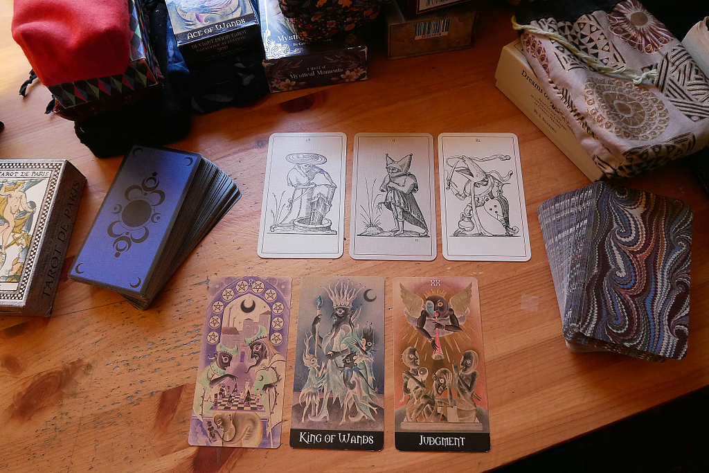
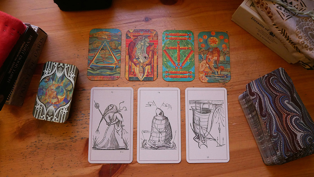
Experiments are on-going in terms of seeing how the deck feels to use. I’m currently focusing on exploring how it reads in conjunction with other decks. You can see a sneak peek of that in the video – I show it next to the Carnival at the End of the World Tarot – but here are some photos of other combinations explored this week:
Dreams of Pantagruel with The Deviant Moon (Paradoxical) by Patrick ValenzaDreams of Pantagruel with a modded Crystal Tarot – incidentally, also an ‘in-between’ deck system…
You can also see it in the featured image for this post along with some very interesting input from the Golden Tarot by Kat Black.
Decks Shown in the video –
Trionfi della Luna Tarot – Pagan Otherworlds Tarot – Medieval Scapini Tarot (modded) – Crystal Tarot (modded) – Hush Tarot Magicae Daemonibus Tarot – Tarot of Mystical Moments – Lonely Dreamer Tarot – Carnival at the End of the World Tarot … deck mentioned but not shown: The Dreaming Way Tarot
As some of you will know, I was honoured earlier this year to be able to interview Linnea Gits of UUSI specifically about the art and artistic process of creating her very well known “Pagan Otherworlds Tarot”. As noted below, a copy of the deck has been acquired by the MIT Libraries’ “Distinctive Collections” project but it has also seen multiple print runs over the years. As an indie deck originally released in 2016, it’s a good example of a deck in continuous demand as well as rewarding long-term study, curiosity, and use.
I have kept the transcript below limited to the conversation I had with Linnea. My aim is for this post to function as a companion to the video I made about the interview as well as a reference piece in its own right. However, I have also explored some of my own ideas and personal associations with the POT in a dedicated playlist on my channel.
I hope you enjoy the interview as much as I did!
—
Process / Technique
Sorsha – The Pagan Otherworlds Tarot is well known for the quality of paintings it offers to its readers. Can you tell me a bit about the process for creating the deck?
How did its conception/aims/themes guide your choice of medium or technique?
Linnea – “As with all our work, traditional mediums become the backbone of the artwork as they lend the imagery emotional energy that computer-generated imagery cannot. We chose oil painting for Pagan Otherworlds because we felt traditional oils would give the imagery a richness and depth that is hard to achieve in other mediums. We also loved the long history of this medium’s use in fine art painting and felt it would elevate the work into a powerful space in the imagination.”
Sorsha – For those who are artists or painters themselves, can you tell me a bit about your preferred methods – preliminary sketches, stylistic choices, color palette, brush strokes…
Linnea – “I think the second most important aspect of our creative process is that our work is made with a particular purpose and use in mind and almost always has a strict deadline for its completion. We do not have endless time or money to work with, so each step has to be as efficient as possible. We usually begin with a mood board comprised of images and colors that we are inspired by for the particular project we are creating. For Pagan it was a lot of Renaissance paintings and botanical paintings. There is about a month or two of pushing that imagery, sketches, and ideas around on paper and the computer working out the style, content, techniques, and rough compositions. Once we feel the work becoming fluid, we move into the final hand-sketched pieces and, as with Pagan, the final oil painting once all is roughed out.”
“One thing to note: A lot of people think that the paintings for this deck are on large canvases, but we never work that way with our decks. We generally work in a 9″ x 12″ format as we create work for a 3″ x 5″ card, and working on this scale allows us to move quickly through paintings and keeps the imagery focused on the essential message it is expressing. We also need to be able to scan all the artwork so we can bring it to the computer to set up the files for print. Large canvases would require a much more expensive and time-consuming documentation process to get the imagery into the computer and ready for print files.”
“Are there any digital component to the images? Were the cards approached in a layered fashion (such as background, foreground, suit elements on top?
In terms of possible digital components, I imagine deck creators must face a lot of repetitive imagery across the tarot system. It seems clear that some kind of digital layering would be useful in keeping the minor arcana cards visually consistent with each other. Are there any particular ways in which you approached this?”
“We did not create any of this art digitally, but we do use the computer as a tool to edit, compose, and touch up the paintings in preparation for print files. For Pagan, we started by creating the suit symbols for the deck and a calm, blue-painted background that would be the canvas for all the cards. This working process allowed us to scan the suit symbols, cut them out in the computer, and then arrange them on the simple, painted background. As we moved forward with each painting, we were constantly bringing the artwork into the computer at the very beginning to see how it was reading in its card format. You don’t want to get too far down the road on a painting only to discover you should have moved an object lower in the artwork so it doesn’t compete with the suit symbols or that the forms are too heavy and are overwhelming the card. A lot of this process was felt as I worked, but I have found that keeping an eye on how it looks in its final card format helps me from overworking a composition and also brings a very effective edit on the overall structure of the piece.”
“Whenever possible, we want a complete painting. Still, there are times when we have had to photoshop a painting to remove an unnecessary object, or even in the case of the King of Swords, for example, to cut off his hand in the computer, repaint a better gesture, scan that painting and paste it on to the final painting in the computer. Basically, there are no strict rules on how we work the paintings, as the most important thing is that, in the end, the final piece communicates and expresses the essential meaning of the card.”
Sorsha – A question for Peter Dunham!…What kind of ink and pen did you use for the lettering work?
Linnea – “Peter used Japanese ink with “Brause” pen nibs.”
Art References
[I asked a range of questions that Linnea collated together into a single answer. Below, I have listed some key examples of the questions I asked – to give a sense of the direction I was pursuing – followed by Linnea’s wonderful answer!]
Sorsha – The deck has been chosen as an MIT Distinctive Collections acquisition – which is focused on expansive, socially progressive, inclusive decks; decks that innovate the system of Tarot; and decks that have pushed the boundaries of the publication industry (such as with the development of Kickstarter and crowdfunding). I think it’s also a prime example of an ‘art-literate’ deck… Can you tell us a bit about any possible art historical references in the deck?
*I have mentioned the Vienna Dioscurides bramble online before but I also suspect I see the influence of Ithell Colquhoun in the 2 of Cups (for instance)… are there any other moments like this in the deck?
*What was that process like?
*Was this part of your previous approach to art – either personally or through any particular form of education/career work?
Linnea – “The Vienna Dioscruides bramble!! When I was moving through the artwork on this deck, that work was one of the first inspiration pieces that I pinned on the mood board. It had an incredible feeling of being scientific and incredibly expressive – it was art as its most alchemical.”
“The PO artwork started with the Major Arcana. When I got to the Minor Arcana I had been painting about 6 hours a day for almost four months. But when I started the Court cards, I suddenly felt the whole deck click into place. To me, the Courts defined the look and feel of the deck more than the Major Arcana. The Courts are where it all came together and are some of my favorite paintings in the deck. Re-energized by that work, I moved into the “pip” cards. We had decided to keep people out of the pip cards as we wanted to leave space for nature to shine. We wanted an “ego-less” space that accepted whoever entered it – a place of contemplation that would calm, energize and clarify in that unique way you experience when entering nature.”
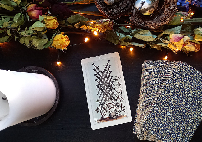
“The VD bramble just throbs with this kind of energy. It was a touchstone for this deck, and I knew I had to find a place to slip it in. I wanted to bring something old and magical into the work, but my intention was to recreate it, not collage it. So I dropped it into the 10 of swords composition on the computer as a place-holder and moved onto another composition. However, I was moving so fast at that point through the pip paintings because we had less than a month to complete all the artwork and set it up for print. To make our deadline, I was now working at a speed I was feeling uncomfortable with, and I never did repaint the VD bramble – it ended up in the deck without my realizing it until the deck was being proofed, and by that point, there was no more time left for painting. It felt a little magical, though, that it had snuck its way in, eager to reincarnate in a modern era inside the spiritual object of a tarot.”
“I am unfamiliar with Ithell Colquhoun, but The Two of Cups is another special piece for me in this deck. Many years ago, I read an article in National Geographic about the sandstone arch formation known as the Eye of the Needle. It is located along the upper Missouri River in South Dakota’s Black Hills along Needles highway and was formed by the water and wind of deep time. From where the photographer shot it, you looked through the “eye” down what seemed like an endless stretch of river to a setting? rising? sun. It appeared that the two stones had pressed their heads together and created this beautiful river dream together. The elements passed through and around them, down the shared river dream that reflected the sky in its pale-blue, glass-calm eternity. Enchanted, I cut the photo out of the magazine and placed it in the top corner of our studio mood board. I had no intentions of using it for anything, it just filled me with peace and joy. It was there for over ten years. And then, one day, it asked to be included in the PO tarot and it knew exactly where it what it wanted to be – in the Two of Cups.”
—
I will end with the closing remarks I sent Linnea in our correspondence:
“Personally, I have deeply enjoyed exploring this deck with the aim of asking questions. As the guidebook states, this is part of the purpose not only of this deck but Tarot and mysticism as well. In my opinion, one of the really luxurious and needed aspects of this deck is its open, quiet quality. In a world of fast movement and frenetic decision-making, a little ‘meandering mysticism’ and dreamlike vision is both a tonic against a demanding world but also a challenge – the Otherworld is liminal, we pass through, inhale deeply, walk on, and eventually return somewhat changed. (And of course, the border is never very far away.)”
That’s all for now. Safe travels in your journeys over the border & happy card reading!
~ Sorsha.
Notes – some useful links about the art mentioned in the interview as well as all UUSI related links!