Time for some #spooky #autumnal #fallvibes! Featuring tarot and witchy shit. Call me crazy, but I think there’s something in this group of concepts – something creatively stimulating at least!
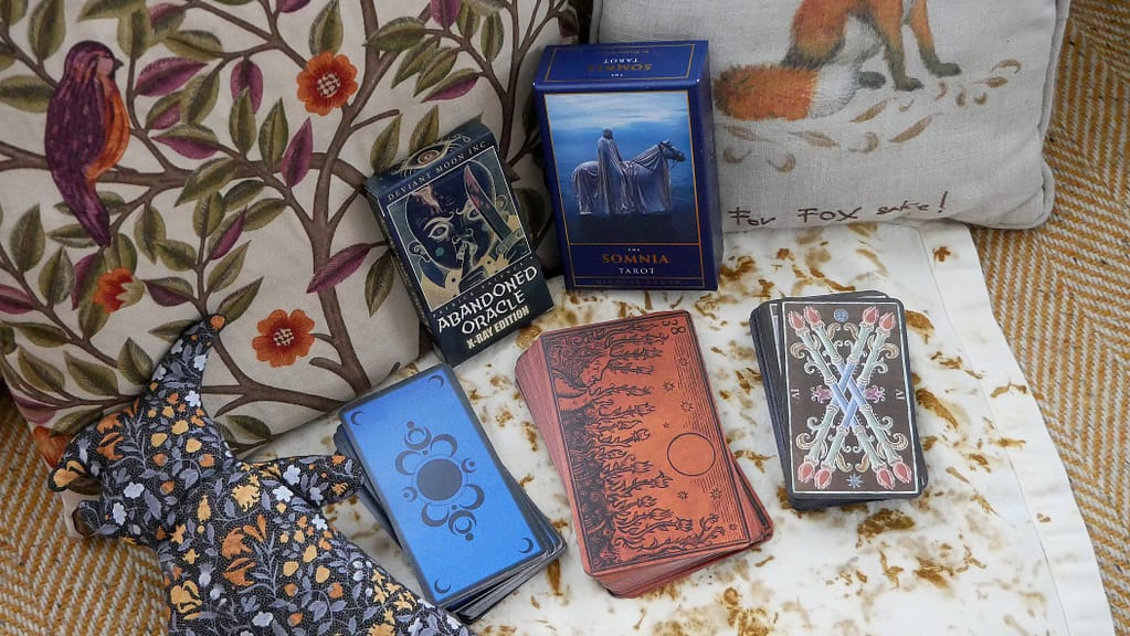
Decks featured:
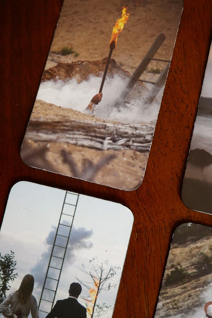
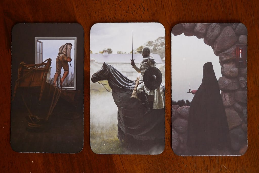
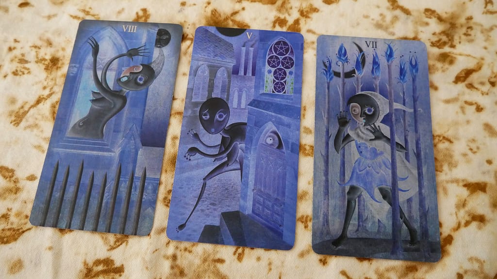
The Somnia Tarot by Nicolas Bruno
The Deviant Moon Tarot (Paradoxical edition) by Patrick Valenza
Something that has gripped my imagination my entire life is the idea of ‘Building Other Worlds’. Importantly, I don’t mean only as ‘substance behind narrative genres’. World-building for a fantasy novel or for game play, though deeply interesting, is only one popular iteration of a much broader interdisciplinary creative drive to make and experience other worlds. What of Art? Architecture? Costume? Music? Theatre? Ecological experience? Folklore? What of symbolism or spacial awareness? Where do we get ideas for what our worlds look like and what tools do we use to build them?
I have been wanting to write about this for a long time but have been puzzled about where to start. Do I start by explaining some things about art history? About perspective, image composition, numerology? Do I dig into how tiered worlds in late medieval and renaissance literature make their way into contemporary visual language? What about modern art? What about tarot or oracle? Witchcraft, sewing, or poetry? Would tracing themes of port cities and their proximity to marshland or wetland habitats get the message across? What about folkloric recordings of Victorian vs. Medieval streets in Irish town centres!? Ultimately, I realised I’m going to have to start where I am and, if you wish, you can follow me down each corridor as and when I get there.
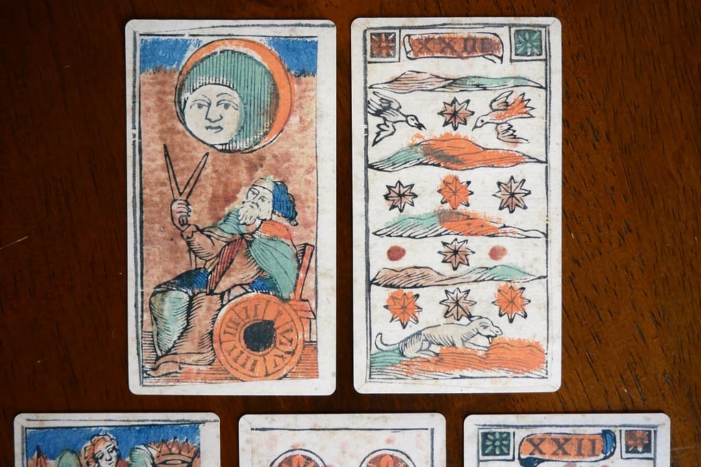
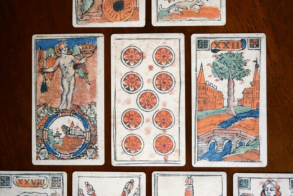
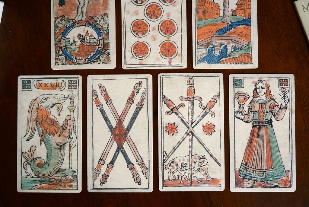
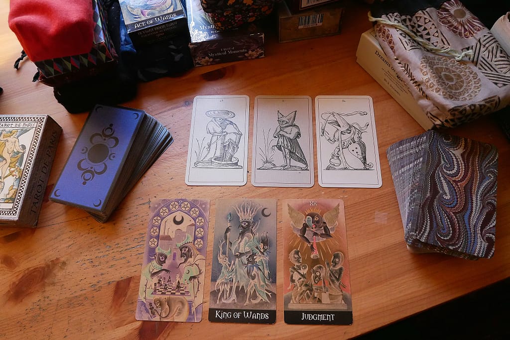
Here are some purposefully drawn 18th c. Minchiate cards illustrating how card visuals can help you construct doors to Otherworlds and populate them in turn with architecture, characters, and landscape …with pips for ‘scaffolding’!
Recently, I revisited some books that were instrumental in helping me to identify myself when I was young. These follow very much in a similar vein to other favourites of mine such as Pish Posh, Said Hieronymus Bosch, The Books of Earthsea, The Chronicles of Prydain, The Hounds of the Mórrígan, or Jonathan Strange & Mr Norrell… and I took special care to obtain secondhand copies of the specific covers I grew up with as well.
I have yet to re-read The Raven Ring although I know I will love it as I can’t remember how many times I would have read it growing up.
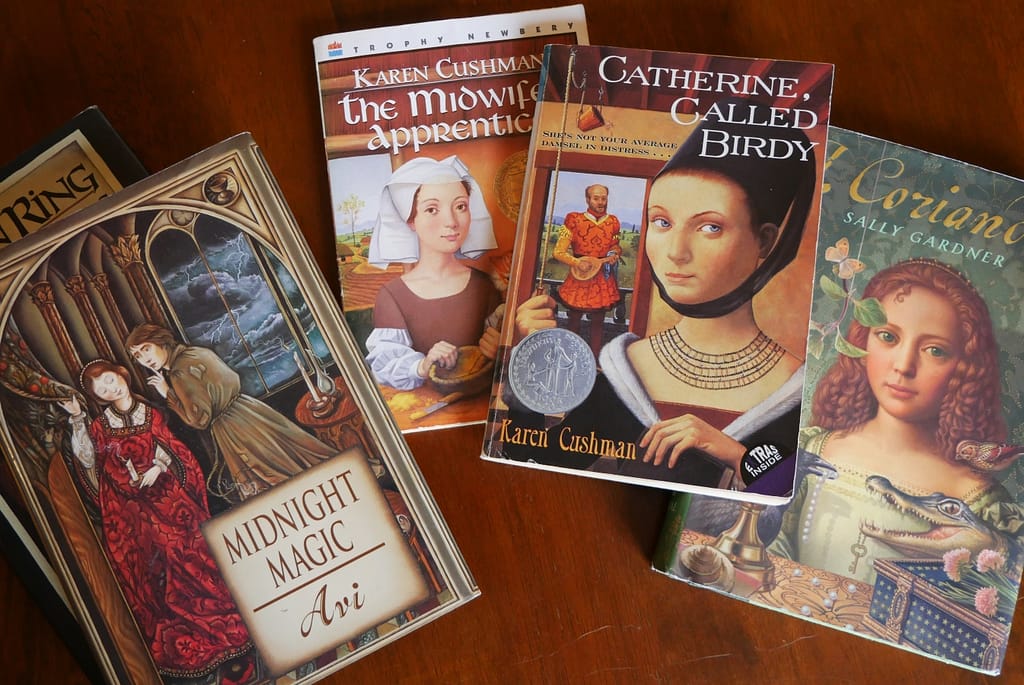
There are five books in all (for now) – each of which features scenes relating to tarot, tarocchi, or otherwise emphasise attention to historical detail within their fictional plots.
* Midnight Magic by Avi (part of a series that didn’t exist yet when I was younger. I won’t talk about this one much because – as it turns out – it wasn’t as good as I remembered and it’s representation of tarot is tangential to the plot and seems fairly ignorant of what tarot is. I still LOVE the cover though!)
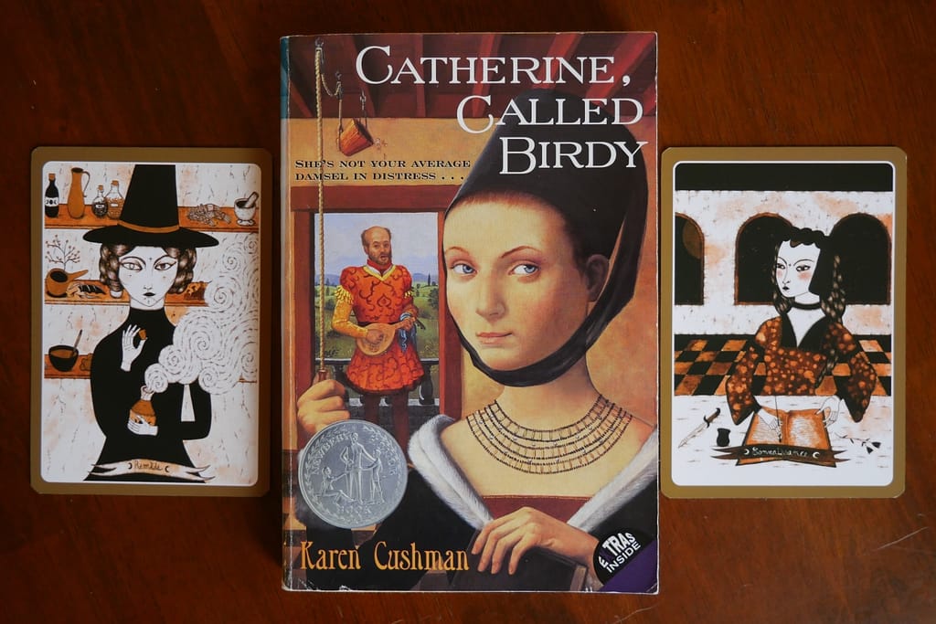
* Catherine, Called Birdy by Karen Cushman (no, I am not going to watch the new film abomina…I mean, adaptation of this beautiful wonderful highly intelligent book.)
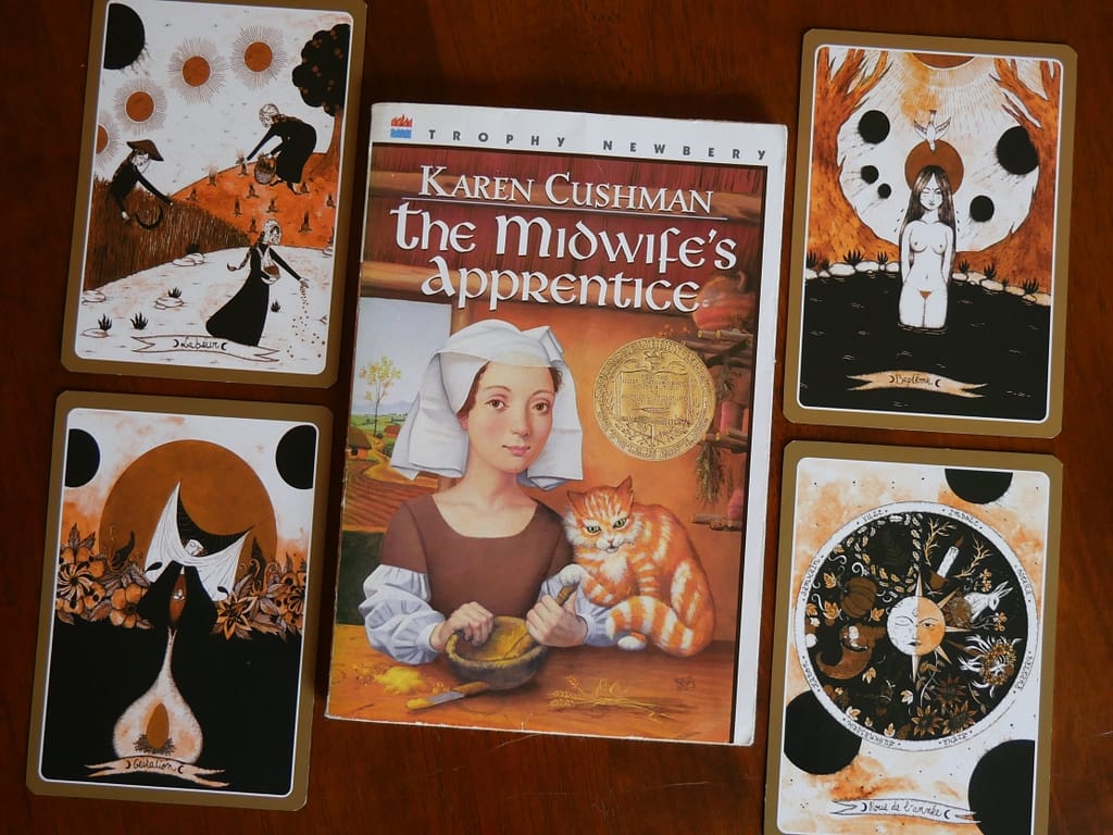
* The Midwife’s Apprentice by Karen Cushman
* I, Coriander by Sally Gardner
* The Raven Ring by Patricia C. Wrede (part of the Lyra series but I have not read any of the others.)
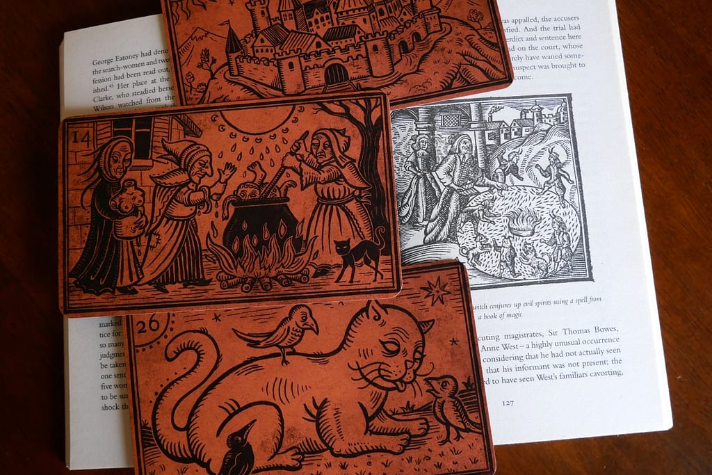
The Midwife’s Apprentice is pictured here with selected plot-relevant cards from Oracle Médiéval et Merveilleux by Gulliver l’Aventurière & Julien Miavril. (No spoilers!)
For one thing, all of these books (except Midnight Magic) were aimed, perhaps, at Young Adult readers generally socialised as feminine but at no point did they talk down to them. They were an excellent foray into how creative and narrative detail coexists wonderfully with good historical enquiry. There is an emphasis on trade and commerce. Some of these feature port cities or otherwise thriving commercial principalities and their conflicts with rural living and tradition. They discuss textiles as if their readers can and will care about how they affect plot. And they treat Otherworlds and/or magic with the same expectation: that readers are curious to know detail and will put in the imaginative effort. To me, this is how the imagination grows.
Catherine, Called Birdy is pictured here with two cards from the Oracle Médiéval et Merveilleux that are… relevant to the story. 😉
Artistically, a glance at these covers will possibly explain a thing or two about my own preference for facial portraiture and the art of the late middle ages and early renaissance. The time periods in the books vary a little more widely than the covers. I, Coriander, for example, is set mostly in Cromwellian England and the time period represented art historically on Catherine, Called Birdy is about 200 years later than the setting of the book (i.e. 15th century visuals [1] vs 1290-1291 book setting.) I was lucky enough, however, to have an aunt who overlooked things like that. For example, she focused instead on showing me how the play in perspective with the rope and bucket and the figural proportions on the cover of Catherine, Called Birdy were all little art historical jokes that the artist had borrowed from real historical painters. The implication was that if I was clever and curious, I could find them out …and I did!
Obviously there is so much to say even just about these books… so for now I will draw a few connections between I, Coriander and a few tarot and oracle decks that I have.
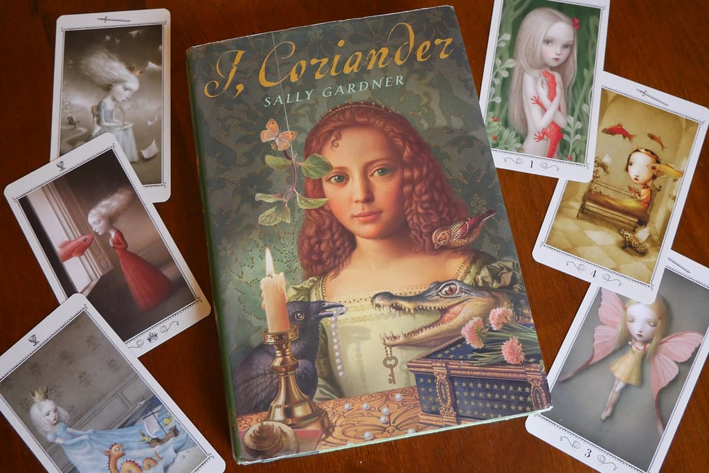
I, Coriander pictured here with selected cards from the Nicoletta Ceccoli Tarot. Once again, the penchant for strange emotionally intelligent portraiture!
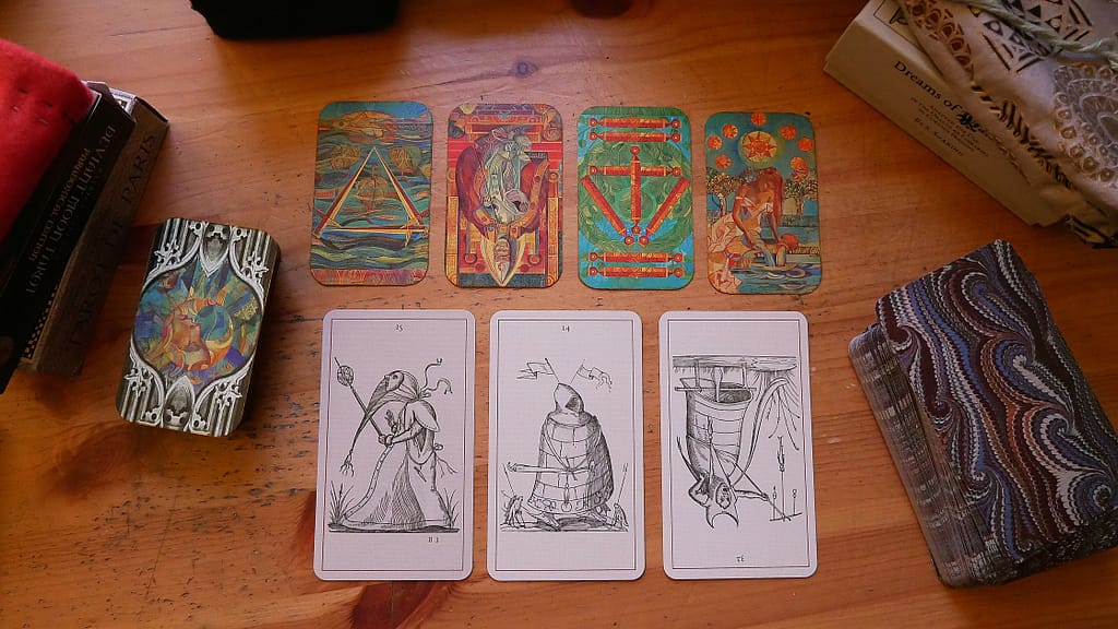
In the first place there is reference to a pair of wedding portraits in I, Coriander …a woman in the foreground holding an oak-leaf, a tiny hunting scene nearly hidden in the wooded middle-ground behind her, and a citadel in the distance. Her spouse is positioned in front of a fantastical city with a river or estuary intended (thematically) to mirror his connection with trade and the Thames. But in this city, there are mermaids and fantastical boats in the water among other things… I couldn’t help but picture certain cards from the Trionfi della Luna (paradoxical pictured below.) Or perhaps wander into a landscape just beyond the borders of such a city… might we find the world of the Somnia tarot there? People in old robes and linen shifts wandering in among the wetlands and sedge grasses gazing at the stars or riding silent sad horses?
Cards chosen from the Trionfi della Luna to mirror aspects of the story in I, Coriander… along with various imaginings of my own about the space we inhabit in the Somnia Tarot.
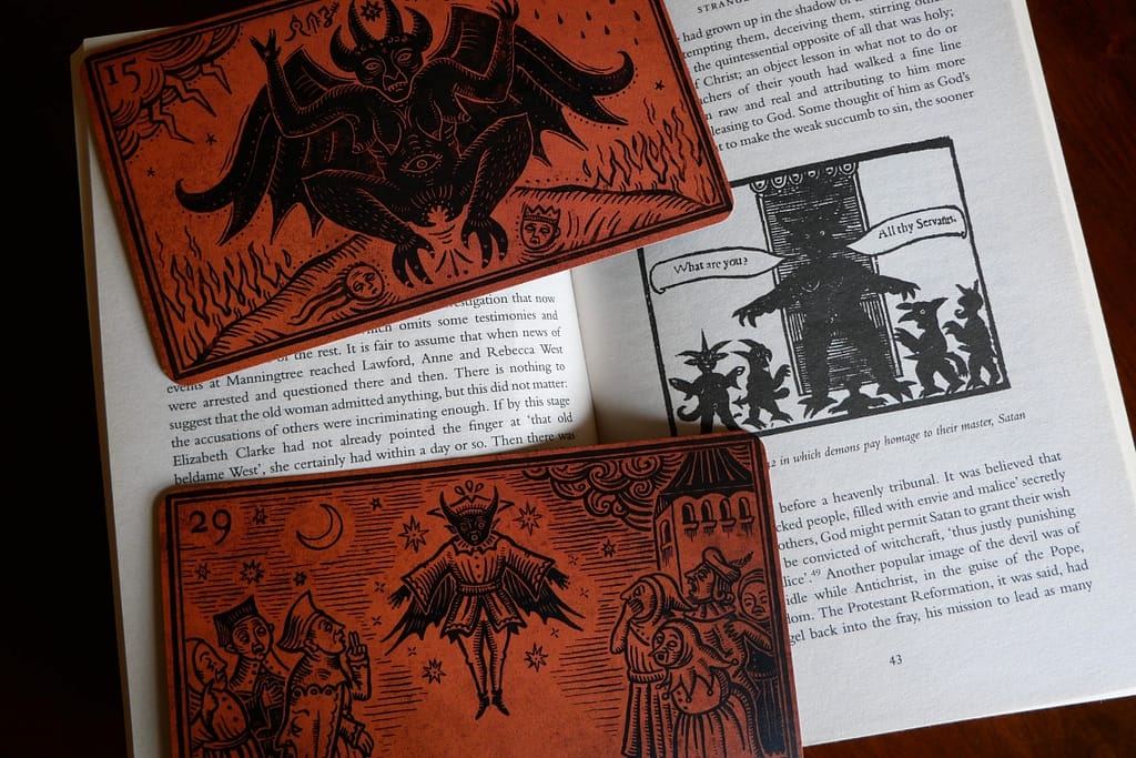
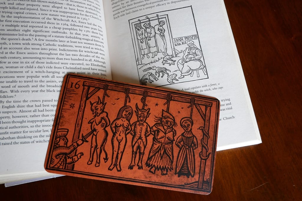
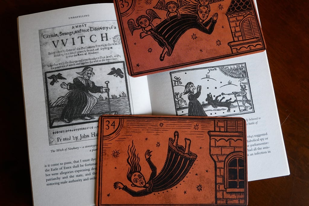
I should note I have also recently read Witchfinders by Malcolm Gaskill and am currently working my way through The Witch: A History of Fear from Ancient Times to the Present by Ronald Hutton… Of course, in so far as witch hunts in England overlapped with civil war tensions between Royalists and Parliamentarians (and occurred along Puritan vs ‘Popish’ lines), I, Coriander made for an excellent fictional backdrop! Also, I really enjoyed drawing cards from the Oracle of Black Enchantment (also by Deviant Moon Inc.) while reading Witchfinders as a visual processing exercise*.
Pages from Malcolm Gaskill’s Witchfinders featured here with various cards from the Oracle of Black Enchantment (Samhain edition.) Patrick Valenza’s art historical source material (at least in part) should be fairly evident…
Lastly, this emphasis on the detail of Otherworlds – their textiles, buildings, landscapes, emotional experiences, social relationships, flora and fauna etc. – is playing a huge role in my current artistic endeavours. I tend to see pip decks as decks full of concepts/characters (in the majors and courts) and their scaffolding and architectural surroundings (in the pips). Sometimes this visual architecture is metaphorical and sometimes it is fairly literal. It depends on the reading. But it’s also helping me to tease out what it feels like to think of tarot decks in this way and what that might mean for creating a tarot deck of my own. Furthermore, I have been rebuilding a former world of mine and have recently begun sewing some clothing that I envisioned there…
And, of COURSE, the Pagan Otherworlds Tarot… featured here over (deadstock) cognac red crushed velvet ::drool::
Perhaps the act of sewing my own clothes is really the process of bringing fairy clothes over the divide? It would explain the time traveler vibes, don’t you think? 😉
So… this post has mostly been about my own personal explorations and impressions. I plan to return soon, however, with some better grounded and CITED analytical material about art history and technique.
Sincerely,
Saoirse.
* Please note! Literally any deck will aid in visual processing or reinforcing thematic content for literally any book. There is no need to acquire any deck not already within your means or comfort zone. Decks/products/material items are mentioned here for illustrative purposes only! It’s PRAXIS that matters.
** All decks featured here of my own volition and arising from my own use of them. I have neither been invited nor commissioned to do so and I have no affiliation with any of their creators. The TdL (paradoxical) was a private gift from a friend. All others were purchased by me.
[1] See images by artists like Petrus Christus (especially ‘Portrait of a Young Girl’, 1460s) and his contemporaries. The cover here has a very Burgundian look with a single truncated hennin among other distinguishing features…
It’s birthday month… and for the last few months I have been working away on what visual links I can find in certain tarot and oracle decks, who created them, where they were created, and what I think that means about the experience of place on the minds of those prone to nightmares. I’ve been calling this the “Nightmare Children of the Tri-State Area” project… but of course if we approach it art historically, it will always be rather Beksinksi or Bosch-like in this realm too. (Also Escher…)
“In Hoc Signo Vinces” by Zdzisław Beksiński. Reproduced here under Creative Commons Licence (Attribution Non-Commercial Share Alike 2.0 Generic) from “Gandalf’s Gallery” with whom I have no affiliation. Another amazing Beksinski piece to check out is “Figure (1978)”.
For now, here’s a sneak peek into what artistic themes are playing a role here:
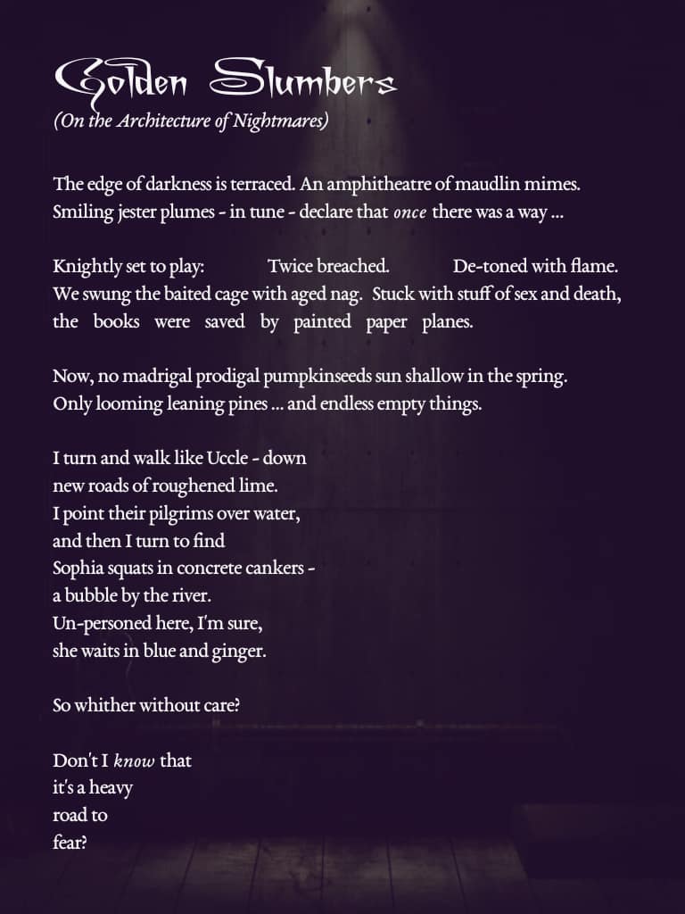
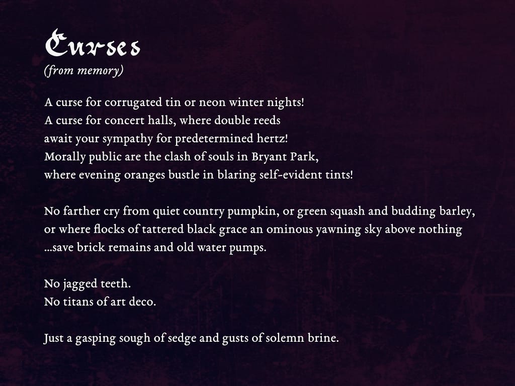
“Six in the City” A & B ~ self-portraits from old photos edited together with my own outdoor photography.“Golden Slumbers” is a poem I wrote on October 14, 2023 while walking through my memory of specific nightmares and giving them more collective language. I have been feeling very inspired by Escher and Piranesi in this, among others…“Curses” is a poem I wrote on November 26, 2023 while walking through my memory of specific experiences in the wetlands around New York and New Jersey… and giving them more collective language.
The decks in question*:
More sketches, explorations, and thoughts to follow soon! In the meantime, let me know what you think 👻
Hell Panel (detail), Garden of Earthly Delights, Hieronymus Bosch (between 1490-1510?) Reproduced here from Wikimedia Commons.
Sincerely,
Sorsha.
* All decks featured here of my own volition and arising from my own use of them. I have neither been invited nor commissioned to do so and I have no affiliation with Deviant Moon Inc. or Nicolas Bruno. Apart from having one of these decks (the TdL Paradoxical) given to me by a friend, I have purchased all of these myself.
This week’s video is, in part, an update on my tarot & art practice, projects, & preferences… as well as a discussion of archetypes, imagination, and social expectations. I find endless interest in how this comes to bear on decks that defy or exist tangential to traditional tarot systems.
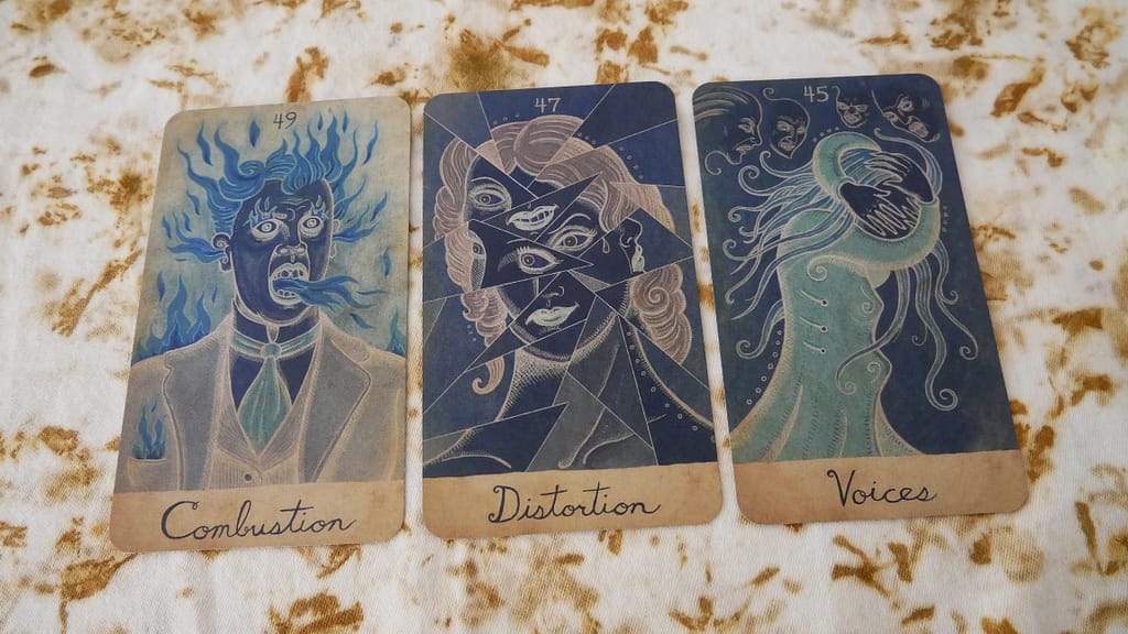
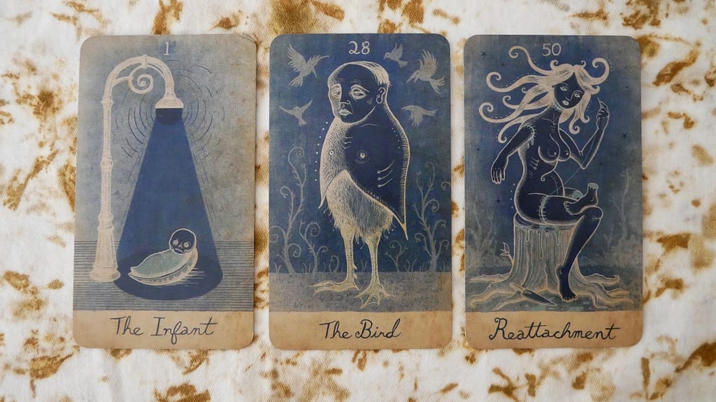
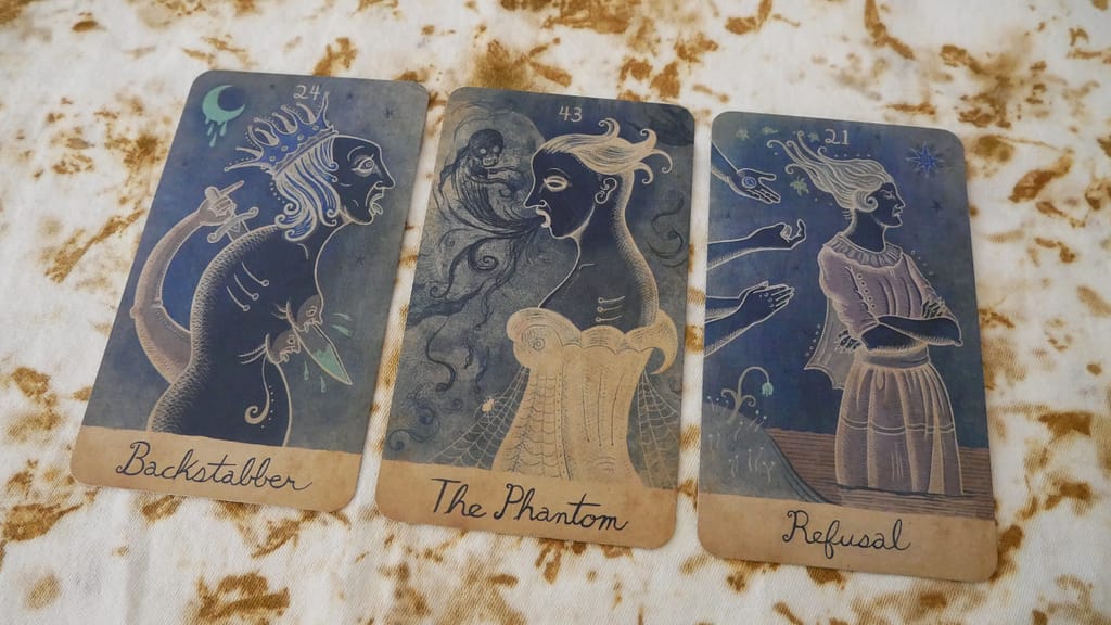
I also briefly showed my current Oracle deck project, titled “Dreams of Pantagruel”. I will dedicate a video to introducing it properly soon but I must also say a special THANK YOU to Lennan Smith, who made me aware of these images in the first place! I’m still blissfully going down the rabbit hole on this one.
Experiments are on-going in terms of seeing how the deck feels to use. I’m currently focusing on exploring how it reads in conjunction with other decks. You can see a sneak peek of that in the video – I show it next to the Carnival at the End of the World Tarot – but here are some photos of other combinations explored this week:
Dreams of Pantagruel with The Deviant Moon (Paradoxical) by Patrick ValenzaDreams of Pantagruel with a modded Crystal Tarot – incidentally, also an ‘in-between’ deck system…
You can also see it in the featured image for this post along with some very interesting input from the Golden Tarot by Kat Black.
Decks Shown in the video –
Trionfi della Luna Tarot – Pagan Otherworlds Tarot – Medieval Scapini Tarot (modded) – Crystal Tarot (modded) – Hush Tarot Magicae Daemonibus Tarot – Tarot of Mystical Moments – Lonely Dreamer Tarot – Carnival at the End of the World Tarot … deck mentioned but not shown: The Dreaming Way Tarot
As some of you will know, I was honoured earlier this year to be able to interview Linnea Gits of UUSI specifically about the art and artistic process of creating her very well known “Pagan Otherworlds Tarot”. As noted below, a copy of the deck has been acquired by the MIT Libraries’ “Distinctive Collections” project but it has also seen multiple print runs over the years. As an indie deck originally released in 2016, it’s a good example of a deck in continuous demand as well as rewarding long-term study, curiosity, and use.
I have kept the transcript below limited to the conversation I had with Linnea. My aim is for this post to function as a companion to the video I made about the interview as well as a reference piece in its own right. However, I have also explored some of my own ideas and personal associations with the POT in a dedicated playlist on my channel.
I hope you enjoy the interview as much as I did!
—
Process / Technique
Sorsha – The Pagan Otherworlds Tarot is well known for the quality of paintings it offers to its readers. Can you tell me a bit about the process for creating the deck?
How did its conception/aims/themes guide your choice of medium or technique?
Linnea – “As with all our work, traditional mediums become the backbone of the artwork as they lend the imagery emotional energy that computer-generated imagery cannot. We chose oil painting for Pagan Otherworlds because we felt traditional oils would give the imagery a richness and depth that is hard to achieve in other mediums. We also loved the long history of this medium’s use in fine art painting and felt it would elevate the work into a powerful space in the imagination.”
Sorsha – For those who are artists or painters themselves, can you tell me a bit about your preferred methods – preliminary sketches, stylistic choices, color palette, brush strokes…
Linnea – “I think the second most important aspect of our creative process is that our work is made with a particular purpose and use in mind and almost always has a strict deadline for its completion. We do not have endless time or money to work with, so each step has to be as efficient as possible. We usually begin with a mood board comprised of images and colors that we are inspired by for the particular project we are creating. For Pagan it was a lot of Renaissance paintings and botanical paintings. There is about a month or two of pushing that imagery, sketches, and ideas around on paper and the computer working out the style, content, techniques, and rough compositions. Once we feel the work becoming fluid, we move into the final hand-sketched pieces and, as with Pagan, the final oil painting once all is roughed out.”
“One thing to note: A lot of people think that the paintings for this deck are on large canvases, but we never work that way with our decks. We generally work in a 9″ x 12″ format as we create work for a 3″ x 5″ card, and working on this scale allows us to move quickly through paintings and keeps the imagery focused on the essential message it is expressing. We also need to be able to scan all the artwork so we can bring it to the computer to set up the files for print. Large canvases would require a much more expensive and time-consuming documentation process to get the imagery into the computer and ready for print files.”
“Are there any digital component to the images? Were the cards approached in a layered fashion (such as background, foreground, suit elements on top?
In terms of possible digital components, I imagine deck creators must face a lot of repetitive imagery across the tarot system. It seems clear that some kind of digital layering would be useful in keeping the minor arcana cards visually consistent with each other. Are there any particular ways in which you approached this?”
“We did not create any of this art digitally, but we do use the computer as a tool to edit, compose, and touch up the paintings in preparation for print files. For Pagan, we started by creating the suit symbols for the deck and a calm, blue-painted background that would be the canvas for all the cards. This working process allowed us to scan the suit symbols, cut them out in the computer, and then arrange them on the simple, painted background. As we moved forward with each painting, we were constantly bringing the artwork into the computer at the very beginning to see how it was reading in its card format. You don’t want to get too far down the road on a painting only to discover you should have moved an object lower in the artwork so it doesn’t compete with the suit symbols or that the forms are too heavy and are overwhelming the card. A lot of this process was felt as I worked, but I have found that keeping an eye on how it looks in its final card format helps me from overworking a composition and also brings a very effective edit on the overall structure of the piece.”
“Whenever possible, we want a complete painting. Still, there are times when we have had to photoshop a painting to remove an unnecessary object, or even in the case of the King of Swords, for example, to cut off his hand in the computer, repaint a better gesture, scan that painting and paste it on to the final painting in the computer. Basically, there are no strict rules on how we work the paintings, as the most important thing is that, in the end, the final piece communicates and expresses the essential meaning of the card.”
Sorsha – A question for Peter Dunham!…What kind of ink and pen did you use for the lettering work?
Linnea – “Peter used Japanese ink with “Brause” pen nibs.”
Art References
[I asked a range of questions that Linnea collated together into a single answer. Below, I have listed some key examples of the questions I asked – to give a sense of the direction I was pursuing – followed by Linnea’s wonderful answer!]
Sorsha – The deck has been chosen as an MIT Distinctive Collections acquisition – which is focused on expansive, socially progressive, inclusive decks; decks that innovate the system of Tarot; and decks that have pushed the boundaries of the publication industry (such as with the development of Kickstarter and crowdfunding). I think it’s also a prime example of an ‘art-literate’ deck… Can you tell us a bit about any possible art historical references in the deck?
*I have mentioned the Vienna Dioscurides bramble online before but I also suspect I see the influence of Ithell Colquhoun in the 2 of Cups (for instance)… are there any other moments like this in the deck?
*What was that process like?
*Was this part of your previous approach to art – either personally or through any particular form of education/career work?
Linnea – “The Vienna Dioscruides bramble!! When I was moving through the artwork on this deck, that work was one of the first inspiration pieces that I pinned on the mood board. It had an incredible feeling of being scientific and incredibly expressive – it was art as its most alchemical.”
“The PO artwork started with the Major Arcana. When I got to the Minor Arcana I had been painting about 6 hours a day for almost four months. But when I started the Court cards, I suddenly felt the whole deck click into place. To me, the Courts defined the look and feel of the deck more than the Major Arcana. The Courts are where it all came together and are some of my favorite paintings in the deck. Re-energized by that work, I moved into the “pip” cards. We had decided to keep people out of the pip cards as we wanted to leave space for nature to shine. We wanted an “ego-less” space that accepted whoever entered it – a place of contemplation that would calm, energize and clarify in that unique way you experience when entering nature.”
“The VD bramble just throbs with this kind of energy. It was a touchstone for this deck, and I knew I had to find a place to slip it in. I wanted to bring something old and magical into the work, but my intention was to recreate it, not collage it. So I dropped it into the 10 of swords composition on the computer as a place-holder and moved onto another composition. However, I was moving so fast at that point through the pip paintings because we had less than a month to complete all the artwork and set it up for print. To make our deadline, I was now working at a speed I was feeling uncomfortable with, and I never did repaint the VD bramble – it ended up in the deck without my realizing it until the deck was being proofed, and by that point, there was no more time left for painting. It felt a little magical, though, that it had snuck its way in, eager to reincarnate in a modern era inside the spiritual object of a tarot.”
“I am unfamiliar with Ithell Colquhoun, but The Two of Cups is another special piece for me in this deck. Many years ago, I read an article in National Geographic about the sandstone arch formation known as the Eye of the Needle. It is located along the upper Missouri River in South Dakota’s Black Hills along Needles highway and was formed by the water and wind of deep time. From where the photographer shot it, you looked through the “eye” down what seemed like an endless stretch of river to a setting? rising? sun. It appeared that the two stones had pressed their heads together and created this beautiful river dream together. The elements passed through and around them, down the shared river dream that reflected the sky in its pale-blue, glass-calm eternity. Enchanted, I cut the photo out of the magazine and placed it in the top corner of our studio mood board. I had no intentions of using it for anything, it just filled me with peace and joy. It was there for over ten years. And then, one day, it asked to be included in the PO tarot and it knew exactly where it what it wanted to be – in the Two of Cups.”
—
I will end with the closing remarks I sent Linnea in our correspondence:
“Personally, I have deeply enjoyed exploring this deck with the aim of asking questions. As the guidebook states, this is part of the purpose not only of this deck but Tarot and mysticism as well. In my opinion, one of the really luxurious and needed aspects of this deck is its open, quiet quality. In a world of fast movement and frenetic decision-making, a little ‘meandering mysticism’ and dreamlike vision is both a tonic against a demanding world but also a challenge – the Otherworld is liminal, we pass through, inhale deeply, walk on, and eventually return somewhat changed. (And of course, the border is never very far away.)”
That’s all for now. Safe travels in your journeys over the border & happy card reading!
~ Sorsha.
Notes – some useful links about the art mentioned in the interview as well as all UUSI related links!